Visual Imagery: A Ghost of James Dean, James Dean
By Rob Jensen
A recent design for Come Back to the 5 & Dime, Jimmy Dean, Jimmy Dean staged at Minneapolis’ Theater in the Round presented me with a scenic challenge that changed my thinking about visuals, and also afforded me a chance to explore a different avenue for solving those challenges.
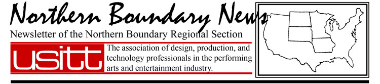
On the surface the play can be seen as a nostalgia piece put on to get audiences in the mood for a given era, but around that is a story about how some times in our lives we get stuck in a comfortable position and do not want the world around us to change. The challenges for the design of this production included, fitting a large cast in a small space, making the set feel like a 5 & Dime while not being able to have walls, as the production was in the round, and facilitating a shift in time from 1975 to 1955. By far of paramount importance, however, was the desire to visually address the idea that the world of the store is the reality that the main character, Mona, clings to in her struggle make it through life. For her the outside it is irrelevant, and almost not real. The director, David Coral, and I hit on the idea, of surrounding the space with a montage of images of James Dean. This was fitting as the play takes place at the reunion of the “Disciple’s of James Dean” a fan club that made a pact to get together on the night of his death 20 years later. Helping to accomplish this idea was that the theater required modesty panels be used in front of the 1st row of all the seating sections.
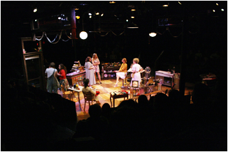 We talked briefly about the fact that they should not be over bearing, but rather be something like the wall paper of characters from past productions at the Guthrie. I then got to work on the various other parts to the set and didn’t think much about this aspect of the design. About a week before load in I started to gather images of James Dean. It was at this point that I started to really think about how the look of the modesty panels should be and panicked. I realized that what I wanted was that photographic realism and not a painted image. The lighting designer, Nicole Fierce, suggested that large format printing was what was needed to make this look right. What I knew about large format printing was in a word, expensive. I had, however, just completed several courses in computer visualization for design that included an extensive over view of Adobe’s Photoshop and InDesign programs so I was confident in being able to do the layout myself. But questions of expense, timeframe, and process where unknowns.

A local company called Big Ink (www.inkbig.com) was suggested as a possible solution to the problem. Upon contacting them I discovered that what was needed to get accurate pricing and lead time was the art work. Layout of that took me about a day. This included some editing in Photoshop and doing the layout out in InDesign, I chose InDesign over just Photoshop as InDesign gave me the ability to work in full scale and thus I could be assured that what was in the screen was what was going to be printed.
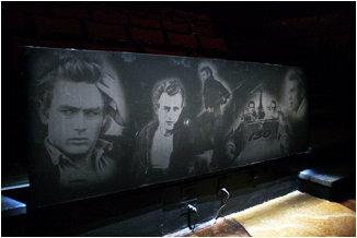
My process was to place on top of a black background layer grayscale image files in their own layers and then used the opacity setting for the layer get the ghost effect. Big Ink set up an ftp server for uploading project files to so it was a short turn around to getting pricing from them. I was faced with a number of options. The biggest revolved around wither I wanted Big Ink to mount the panels or wither I was willing to do that myself. Given the time frame I had wanted the panels to come mounted and thus my install time would have been cut down but the pricing for that was to prohibitive. I did however have a supply of ½” OSB at the theater and on the recommendation of the printer decided to us that to mount the panels to. I opted for having them printed on a 3M product called Control Tack (http://tinyurl.com/3m-controltac-info). This product is used for signage printed on the side of busses and commercial vehicles. I had not worked with this before but was assured by the printer that it was a forgiving product when it came to getting out wrinkles.
 Upon picking up of the panels, I realized one thing I hadn’t thought about. The images looked great on the screen, but under normal light the printouts look really black. My first thought given the roughly $450.00 price tag, was that I had just paid a whole lot for black ink. These fears where easily dissuaded after temporally tacking a spare print to one of the panels the images glowed in a surprisingly eariey fashion.
Installation went much faster than I expected. The OSB having been cut to size had no other prep required. The graphics come on a surface much like contact paper. The difference being that light pressure can allows you to position it and maneuver the graphic till you have it where you want. Then heavy pressure applied with a squeegee affixes the graphic to the mounting surface. You still want to work from the center out and make adjustments as you work toward the ends. The Controltac has microscopic channels in it that allow you to work out air bubbles. 4 panels all 2’ high and ranging from about 6’ to 14’ where done and installed in about an hours time.
 My over all experience with this product and its solution to my design needs was overwhelming positive. Big Ink had a turnaround of 2 days, even droning the New Years holiday, and the install time could not have been faster. Yes, it was on the expensive side and not to be used lightly but given timing we would have been hard pressed to get painters to have done the work for cheaper. Add on top of this the need for photo realism and I can’t argue with the expense. In the end when my designs need this kind of quality and realism I will be looking to see if a printing is a viable option.
USITT National Conference 2011
March 9-12
 Charlotte, North Carolina
Be prepared for fun and excitement at the 2011 Annual Conference & Stage Expo.
Come for the information, find out What's Next!