Makeup Design: A Case Study for
Alice @ Wonderland
by Oliver Rivera
In the spring of 2021, I had the opportunity to design the makeup for the University of Minnesota Theater’s production of Alice @ Wonderland. 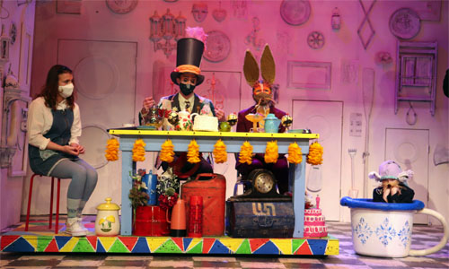 The show was filmed so I had the opportunity to create a design that didn’t need to include scene transition times. However, due to the pandemic I did have to take in consideration the placement of Covid masks, and work with the costume designers to match colors and shapes. My initial inspiration included optical illusions due to the psychedelic themes of the show.
To begin designing, I printed out blank face templates and cut out a paper mask to place over them.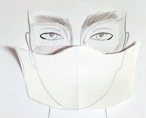 I made a list of characters in the show, and sorted them by scene. Once I had the characters organized, I searched the internet for inspiration, and created a concept presentation with image references.
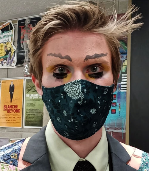
After I shared my presentation and watched the other designers' concept ideas, I made revisions and began sketching. It took a few editions of the sketches to match with the director’s vision and other design elements. Alice was the easiest character to design. The director wanted Alice to be very natural since she is the bridge to reality. I gave the actress a simple brown shadow and a small wing. I found the wing on an Instagram story poll that was asking for the “best natural liner style”. The actress playing Alice was experienced in doing her own makeup so I gave her the design and style, and let her take a little creative freedom.
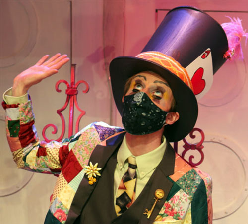
Since half of the character faces were covered by masks, I wanted to play with eyebrow shapes to convey the general attitude and species of each character. I looked up images of interesting eyebrow shapes and found an image of wavy eyebrows. I implemented these for the Mad Hatters' eyebrows and put false lashes on the bottom lid to convey his character eccentricity. For the rabbits I had the actresses block out their eyebrows and glue on hair to represent fur on their eyebrows. 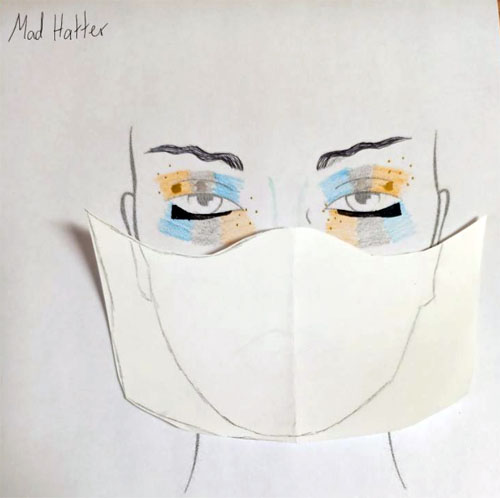
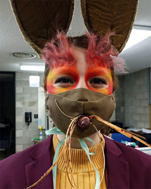
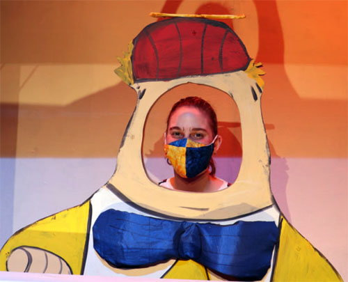
The March Hare character had the fur shaped vertically to contrast with the White Rabbit whose eyebrows and makeup were shaped horizontally. Both of the rabbits had heavy face paint to create the shape of a rabbit's eyes 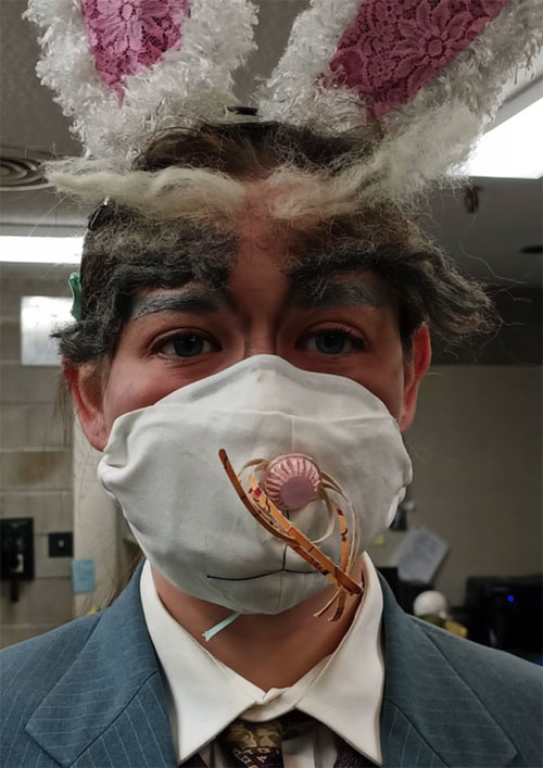 and color to distinguish between the two. The color scheme for the White Rabbit was self-explanatory in the name, but the March Hare took more research. The Mad Hatter’s makeup color was blue and yellow, and the Dormouse was purple. I wanted to unify the colors, but I also had to match the makeup with the costume. The costume was full of fall colors, so I made a fall colored ombré for the March Hare’s makeup fur rather than spring colors.
Another costume that shifted the make-up color scheme was the Caterpillar. I looked at images of caterpillars and they inspired me to play with a full face tie dye effect. Tie dye reminds me of hippies, and the Caterpillar’s character fits the profile. Originally, I designed the colors to be blue, green and yellow. However, the costume had a lot of yellow and orange, and it would have clashed with the blue. Instead, I made the tie dye orange, yellow, and green.
 To continue playing with optical illusions I researched comic book character makeup with lines to accentuate the facial features. This was prominent in the Tweedle brothers design. Their costumes were cardboard cutouts so it was important to highlight their facial features as much as possible.
The flowers were by far my favorite to design. I looked up images of the actual flowers and took note of the distinctive features. For example, the Tiger lily has pigmented freckles in its center. This inspired me to place the freckles on the outer corners of the Lily's eyes. Rose bushes are notorious for their thorns, so I implemented thorns coming out of her hairline so they looked like long baby hairs. 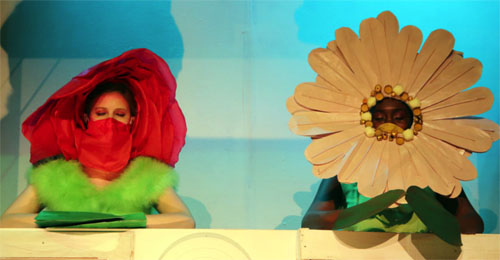 Daisies are full of colorful ombrés and single colored variants. I took some of the prominent colors- maroon, orange, and purple, and created smoky eyes. The feature that stood out to me the most about Violets was the yellow pistil. For this design I added yellow sparkles on the inner corners on top of purple eye shadow with green sparkles on the outer water line. One idea I had that wasn’t implemented due to resources was a double eyeliner inspired by the stripes of some violet variants.
The King and the Queen had matching white face paint with a red heart doily outline to reflect the historical era of Wonderland and the playing-card suit. However, this was not the original design. In the first design, only the Queen had the doily makeup, and the King had a blue color scheme with eyebrows arching in the shape of a heart. The director didn’t feel like it matched the character and wanted it to be more masculine. I provided a few revised designs, but by the time the show was being filmed, we hadn’t decided on a final design. The actor and I decided to match the makeup with the Queen, and fortunately this was the design the director agreed with.
Due to the nature of the show, the scenes were filmed out of order. The actor playing the King also acted as Humpty. The makeup for Humpty was an eggshell white with high arching eyebrows and red blush. Since the King also had white face paint it was easy to record these scenes on the same day. This design was inspired by the director's choice of reference- Marcel Marceau. I looked up images of him and adapted it to fit the egg costume. I also added a beauty mark due to the pompous attitude of Humpty.
Unfortunately, the Door characters caused a bit of controversy. Before the show was cast, the concept given to me by the director was white wood grain with door knockers to fit with the white set. The Doors were all white, and this was the first scene upon entering Wonderland. It made sense to have the faces blend in. However, the show was cast with one of the Doors to be played by a black actress. After talking to the stage manager and other faculty involved, the decision was made to change the makeup design rather than recasting the role. To avoid controversy, I made the decision to make their faces pink and blue. These are colors used to make a 3D effect, and the idea fit with my intention to make optical illusions. I implemented the comic book character makeup idea and mixed it with aged makeup techniques to make them look like 3D door knocker faces.
I learned quite a bit about designing makeup in a collaborative project, and how to adapt during show time. The King and March Hare designs had some issues when it came to show time (the King I’ve already addressed above). The March Hare used fur for eyebrows, but when looking for the fake hair, there wasn’t any that matched the desired color range. We learned how to re-color the hair with eye shadow and primer by taking small groups of strands and pressing the powder on them before spraying with primer.
 Some of the makeup designs required more difficult techniques like eyebrow blocking. Due to the pandemic, the actors applied their own makeup. Before designing for this show, I didn’t know how to block eyebrows so I had to learn and teach the actors. It took a bit of trial and error, because everyone has different eyebrows, but the actors and I were able to work together to figure out techniques to cover different types of eyebrows.
Designing for a collaborative effort can be challenging at times due to the dependency makeup has on costumes, and on conflicting views with the director. However, when it comes to the dependency of costumes, most changes are reflected in the pigments. When it comes to conflicting views, it makes it difficult to come to a decision, as with the King. I learned that sometimes you have to make your best decision at the last minute, and hope the director agrees with it.
Lastly, I learned that it’s important to have more than one person of color in a production and on the design team. When I addressed the issue of white facing a black actress (door character), it came as a shock to me that no one I talked to thought twice about it before I addressed it. Thankfully as a person of color designing the makeup, I was able to have a position in which I could stop it before it happened. I found that you have to stand up for other people of color and address controversial directions when they happen. It was a lesson I wish I didn’t have to learn, but it is important to keep race in mind when it comes to the choices made to create a production. [ ]
Oliver Rivera is a fourth-year student in Theater at the University of Minnesota-Morris. Check out additional images of the design and production of Alice @ Wonderland at Oliver’s online portfolio at https://oliverivera.weebly.com/makeup.html